Crafting Solutions for Meaningful Ideas +1 443 286 3348
CASE STUDY \\ Branding. Visual Design. Art Direction.
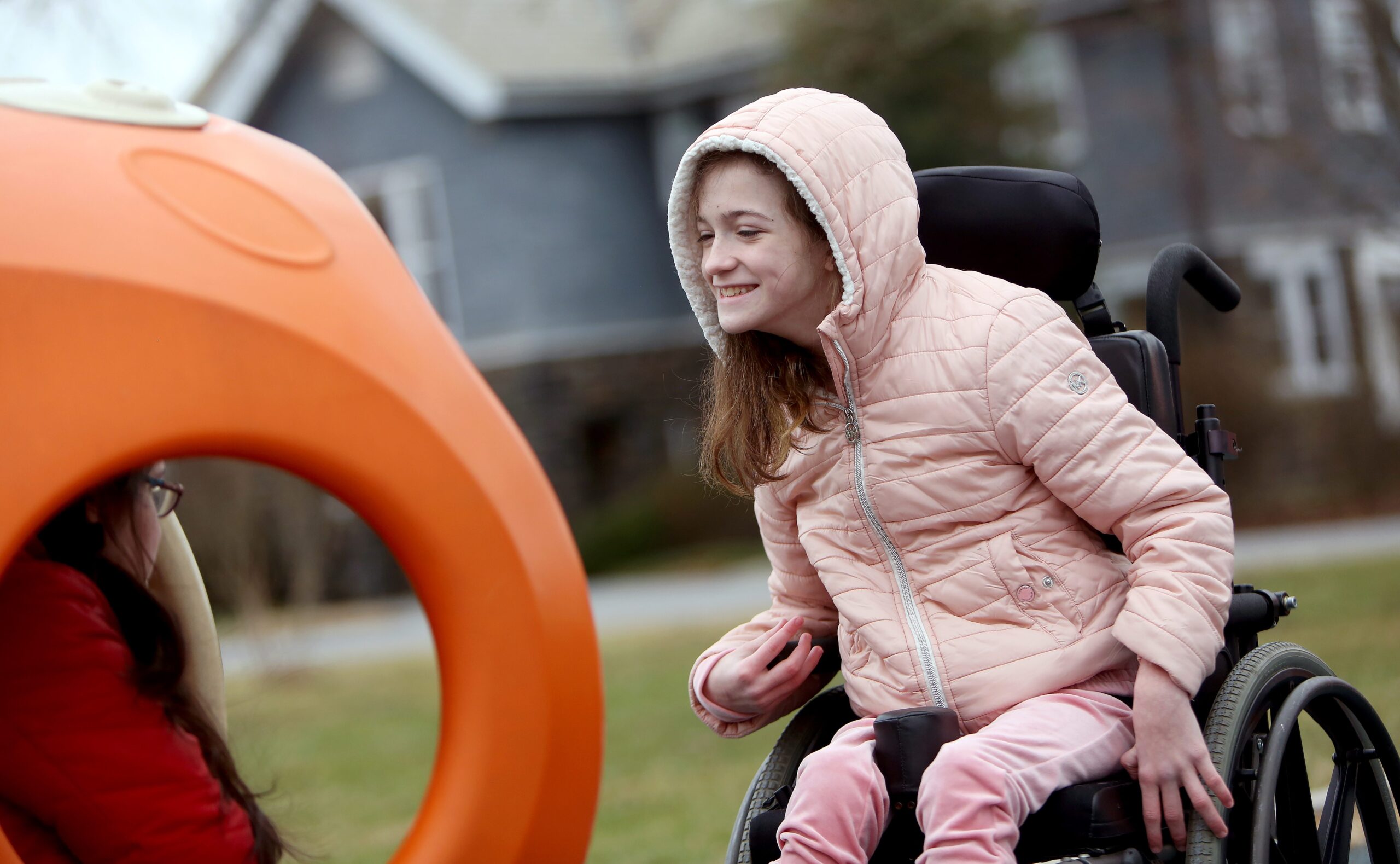
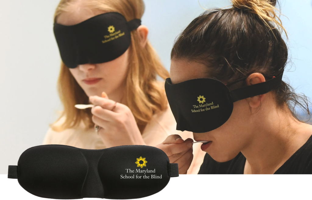
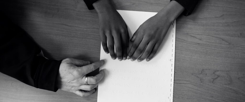
Serving students in all 24 Maryland jurisdictions, theMaryland School for the Blind (MSB) is a private, statewide resource center providing outreach, educational and residential programs to youth who are blind or visually impaired, including those with multiple disabilities.
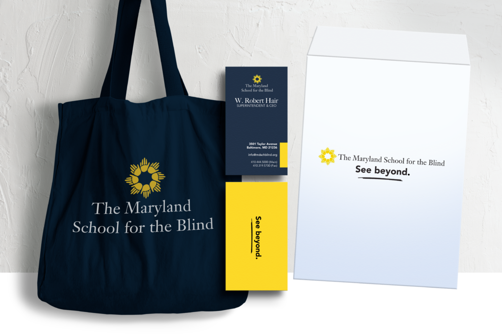
Branding refresh and art direction for the venerated institution in support of marketing, identity and multimedia collateral deliverables (including branding guidelines, web assets, their annual report + other multimedia deliverables).
IN PARTNERSHIP WITH — Dan Schepling (copy) + Kay Fenton (junior designer)
Approximately 6.8% of children under 18 in the U.S. have a diagnosed eye and vision condition. Nearly 3% of children under 18 years have blindness or vision impairment.
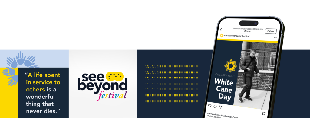
Development included a full branding refresh — including the introduction of the “See Beyond” wordmark — simplified, high-contrast color palette focusing on accessibility-first universal design, codifying branding standards, providing art direction and curation for an extensive photography library and providing tone and direction for MSB’s institution-wide initiatives and campaigns spanning every platform.
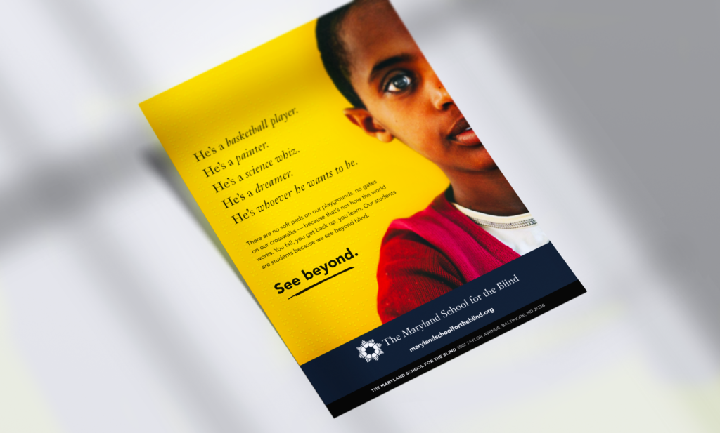
The challenge was to effectively position thebranding to showcase the school’s collegiate-like venerability — reinforcing the Maryland School for the Blind’s authoritative position as the leading institution of its kind — while prioritizing the strength and dedication of the student and faculty’s diverse population and their ability to SEE BEYOND.
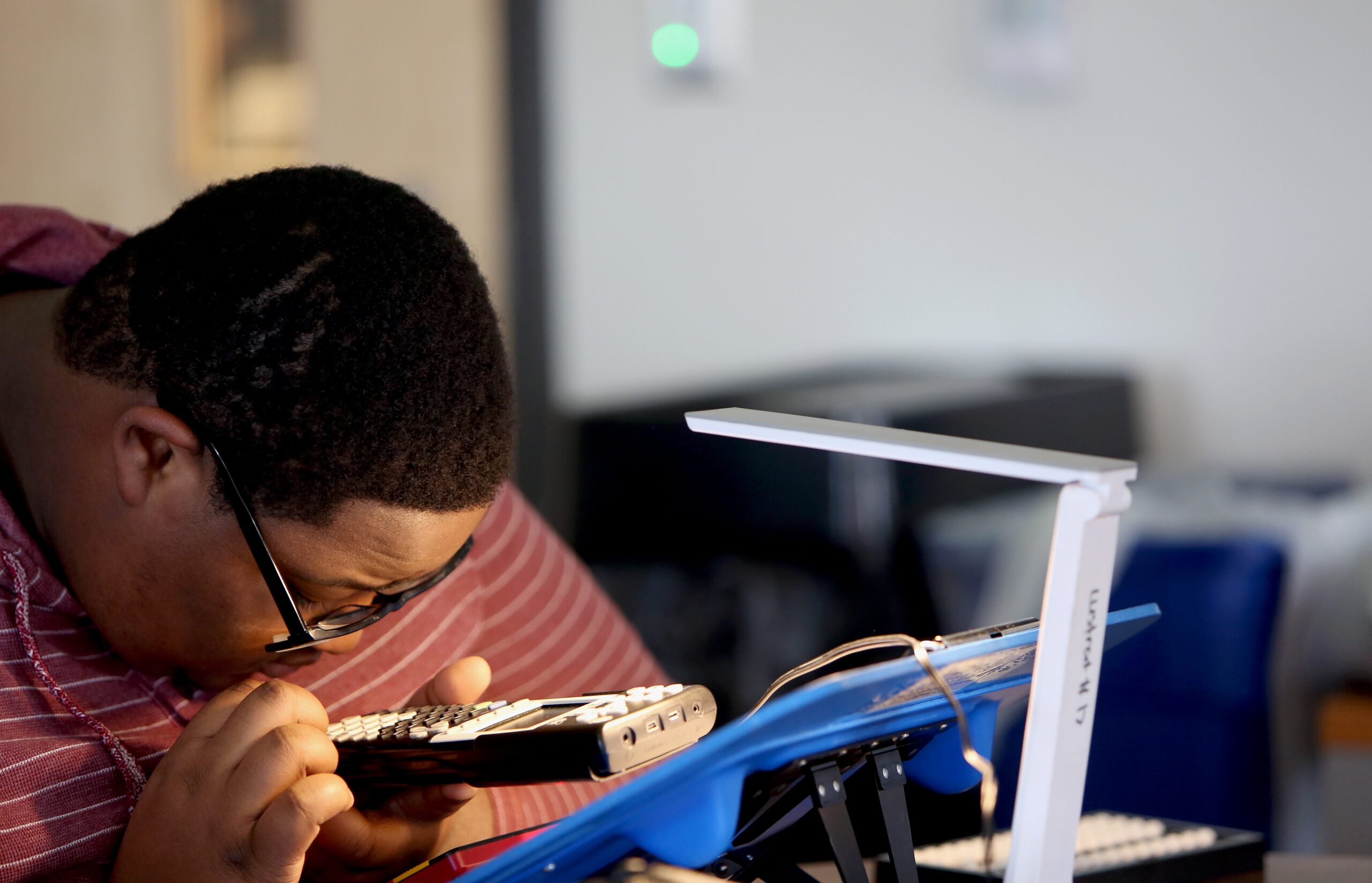
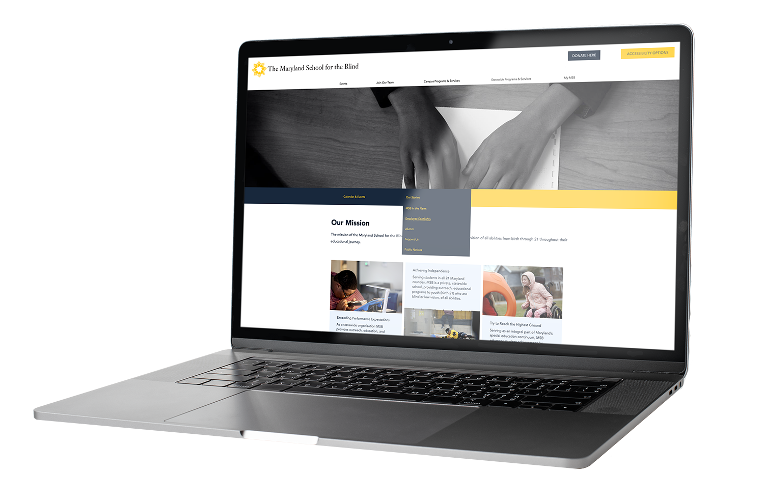
To engage in ensuring accessibility and equity standards are exceeded, 508 remediation and ADA WCAG compliance were a main consideration in the design process, with the goal of allowing ease-of-access across platforms for all users.
Clean readability + contrast, accessibility and a desire to strengthen empowerment for the visually impaired, guided this vision and heavily influenced the color system and high-contrast reading options built-in to the site’s capabilities.
This allows users to select between several color profiles optimized for low-vision readability.